Website Design - Irish Defence Forces
A full redesign of the website and information architecture for a returning client, the Irish Defence Forces
Website Design
Irish Defence Forces
2025

Project Overview
Working with Ireland's Defence Forces for a second time to redesign their digital user experience. A vastly improved sitemap, a new visual design system, and a rebuilt content structure ensured the new military.ie would be a benchmark in the public sector digital space.
The Client
The Defence Forces are the armed forces of Ireland, encompassing the Army, Air Corps, Naval Service, and Reserve Defence Forces. They have been a client since a first redesign and CMS migration project in 2018.
Back in 2018
The 2018 project delivered a responsive redesign of military.ie and migrated the site onto the pTools v7 CMS. It was a solid improvement at the time. By 2025, it was starting to show its age and required a migration to the latest pTools v8 CMS.

The before and after from our first project back in 2018.
My Role
I was the sole UX & UI designer on the agency team and I worked closely with PM and developers.
Design: Research, information architecture, card sorting workshops, template specifications, wireframes, UI design.
Testing: CMS component logic, template and content testing, accessibility, responsiveness, UAT.
Training: CMS training workshops and handover support for the Defence Forces content team.
The Timeline
Months 1–4: Design phase - workshops, research, IA, wireframes, UI visuals
Month 5 -6: Development and Testing
Month 7: Content migration, information architecture review
Month 8: Training, handover, and go-live
Total project duration from kickoff to live deployment: just under 8 months.
The Problem
The Defence Forces website was starting to lag behind in web technology, content accessibility, CMS capabilities, and shifting organisation goals and priorities. The site had a number of issues that needed addressing:
Broken integrations: Social media feed panels on the homepage had stopped rendering due to API failures. They had been left in place, meaning every visitor was seeing broken content on the most prominent page of the site.
Navigation issues: The sitemap had grown without a clear plan, making it harder than it should have been for potential recruits to find career information.
Template limitations: Content had evolved in ways the original templates weren't built for, leading to layouts that felt awkward and inconsistent.
Accessibility gaps: WCAG - WAI compliance had slipped in several areas and dedicated training would be required for new content editor CMS users.
Outdated CMS: The pTools v7 platform had reached end-of-life. Migration to pTools Umbraco v8 was a business requirement, not just a nice-to-have.
The Before (Homepage)
The previous homepage made these problems easy to see:

View the previous website via the Internet Archive, just before this redesign project.
The Objective
The core user value of the website is broadly broken down into two main areas: how to join the Defence Forces; and information on what they do.
The primary objective is the design and delivery of a website that presents information in an accessible, user-friendly, and contemporary way, specifically:
Give potential recruits a clear and simple route to career opportunities.
Increase awareness of what the Defence Forces do and who they are.
Migrate all revamped sitemap and content into the new pTools Umbraco v8 CMS.
Test against accessibility standards and train the client web team in web content management.
The main design outputs were a set of page templates built around the content needs identified during research, alongside a redesigned sitemap to structure the migration.
The Design Process
The project followed a user-centred design process across four phases: Research, Information Architecture, UI Visuals, and Testing (post-development). Recurring weekly workshops with the Defence Forces project team kept progress moving and allowed decisions to be made collaboratively.
Primary tools: Miro (Card sorting), Basecamp (Project management), Figma (Wireframes, designs, and specifications).
Research
A survey was distributed by DF to internal and external stakeholders to gather opinions on the existing site and ideas for the redesign. Submissions were reviewed against project goals, scope, limitations, and requirements. The findings helped focus our solutions laid out in the design decisions you will see below. Common feedback from the survey included internal stakeholders consistently mentioning that recruits couldn't easily find open career info and that most enquiries to the careers office was of content that was hosted on the website but not found.
Analytics review of the existing site showed that career pages were consistently the most visited, but users were taking longer routes to reach them than necessary. The An Cosantóir magazine section had a regular readership but was poorly surfaced in the navigation.
A gap analysis was compiled by the Defence Forces team based on the most common queries received by the information office. This surfaced content that was missing or difficult to find: veterans information covering pensions, medals, and funeral entitlements; requests to visit barracks; military archives queries; TY work experience; and DF history, which at the time was buried under Public Information rather than having its own section
Benchmarking the competitive landscape looked at comparable defence organisations around Europe and the World with screenshots shared across the project team for reference and discussion.
Information Architecture

Card sorting workshops with the Defence Forces project team to redesign the sitemap from scratch.
The existing sitemap was used as a starting point and gap analysis tool. Several structural issues were identified:
The Defence Forces Board was sitting as a top-level navigation item, a location that did not reflect where users would expect to find that content. It was moved under Who We Are.
Public Information had become a catch-all section with a wide and inconsistent mix of content. It was reorganised with clearer groupings.
An Cosantóir Magazine, previously buried under Public Information, was elevated with its own dedicated template and homepage presence.

Sitemap of top level sections and main navigation defined during workshops
Career content was restructured around the four branches, each with its own dedicated landing page. Specific pathways within each branch, including direct entry roles and re-enlistment options, were surfaced at the right level within the branch structure rather than competing for space at the top level.
A key structural improvement to the careers section was moving away from the existing accordion format for current recruitment roles. In the new v8 site, each role received its own dedicated page, making it easier to link directly to a role, share it externally, surface it in search results, and feed into the new dedicated Careers template.
The outcome of the card sorting workshops was a cleaner sitemap with a stronger hierarchy and clearer top-level sections.
Design Decisions
Potential Recruits Come First
Research confirmed that the most strategically important audience on military.ie is the potential recruit. Other audiences, veterans, families, media, have more specific destinations within the site or visit less frequently.
The homepage hierarchy was built around the recruit journey, with the hero, careers section, and primary calls to action all oriented towards someone discovering the organisation for the first time.
Career Content Needed Its Own Template
Card sorting confirmed that career content was both the most visited and the most complex area of the site.
The new sitemap and homepage hierarchy in particular would be tailored specifically to those interested in a career with the Defence Forces.

The old webpage for career opportunities managed as a list of accordions that open to reveal a full webpage worth of content.
A dedicated careers template was designed to handle the range of roles and entry routes within each branch of Army, Navy, Air Corps, and the Reserves.
A persona-driven filtering approach was considered early in the process, where users would identify themselves via a dropdown to be shown relevant identities such as students, engineers, athletes, and IT workers. Post go-live these options were changed to act as filters to the career roles such as direct entry, re-enlistment, and cadets.
The move from a single accordion-format page to individual role pages was one of the more straightforward but impactful UX improvements in the project. Each active role now has its own URL, making external linking, sharing, and search indexing considerably more effective.
An Cosantóir - The Defence Forces Magazine

The previous DF Magazine design layout showing unnecessary static introduction content, a large filtering area, small PDF cover thumbnails
The Defence Forces monthly magazine had a genuine readership but analytics showed the section was underperforming in terms of traffic relative to its actual audience.
It had no homepage presence and sat in a part of the navigation users rarely reached on their own. This was raised directly in workshop and survey feedback as an area that deserved more visibility.
A dedicated template was designed for the magazine, and the homepage was updated to include a section showing the three most recent editions in a swipeable card layout, with new editions surfacing automatically when published.
High Quality Imagery and Video
The Defence Forces had an abundance of high quality imagery and video materials for use online. The redesign put this library at the centre of the visual approach.
A requirement of the redesign was to incorporate this high quality and engaging multimedia where effective, particularly on the homepage and list templates such as file lists, page lists, search, and careers.
Social Media Feeds
The Twitter and Facebook iframes were removed entirely rather than repaired. External social platforms are now linked out to rather than embedded, which avoids the ongoing maintenance risk of third-party embed breakage.
Beyond the curated imagery in the templates, the Defence Forces run an active Flickr account updated almost daily with photography from exercises, ceremonies, overseas deployments, and everyday service life.
This replaced the failed social media embeds with something more reliable and better suited to the volume and quality of visual content the Defence Forces were already producing.
A New Dawn Game

The "A New Dawn" call to action on the old homepage surrounded by links to career links and a play video button
A New Dawn is the online game the Defence Forces commissioned to engage potential recruits.
On the previous homepage it had been added as an afterthought to an existing panel, and the placement did not give it the attention it needed.
In the redesign it was given a dedicated panel with its own visual treatment, engaging video background, and a direct call to action.
Template Definitions
A set of wireframes for common template layouts were defined alongside the main navigation and sitemap work.
Every template had a purpose to satisfy a content or layout need such as file lists, page lists, landing pages, and a dedicated An Cosantóir (DF magazine) and Careers template.
As for the homepage, and in the requirement of keeping the timeline on track, the process moved directly from workshop outputs and sitemap decisions into visual design, with client feedback sessions replacing a formal wireframe review stage.

Each template had a particular role depending on content and layout requirements such as file lists, landing pages, index pages, and standard inside page editor templates.
UI Visuals
Visual design applied the Defence Forces' brand guidelines on fonts, colours, graphics, and across the full template suite.
The tone of the look and feel I wanted to achieve was confident, trustworthy, and aspirational. Every template would have strong use of imagery directly related to the webpage content. The font headings (Sintony), were bold and large. Gold indicated possible user interactions, particularly for buttons.
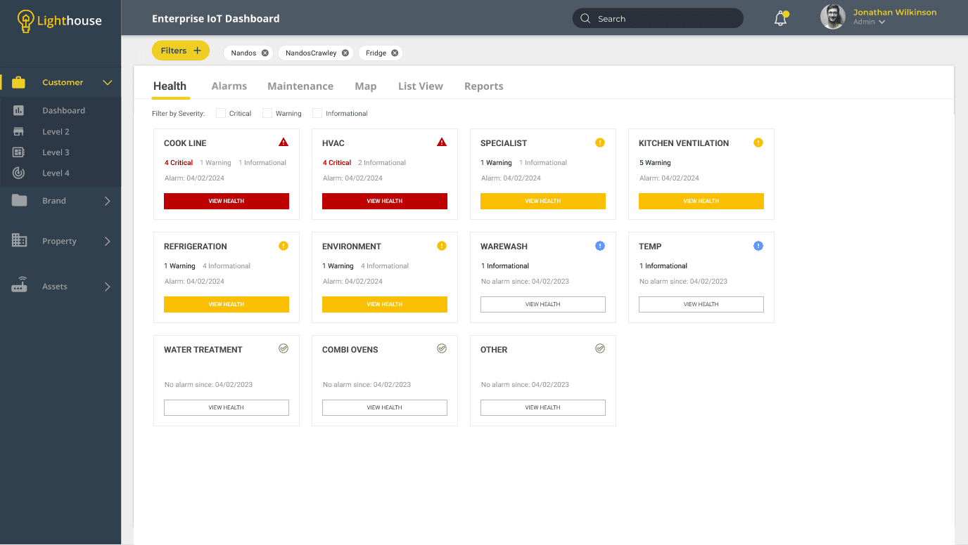
New Careers Template
(Screenshot showing key part of the template)
In the new careers template each open recruitment opportunity is converted from an accordion into its own page which means our template can display roles automatically as a page feed, pulling from each of the main career areas.
The dropdown also allows users to filter and explore up to 15 results at once rather than moving around the sitemap itself.
Each role has its own page thumbnail which visually adds to searching or browsing over the various roles.
Panels seen on the homepage, such as the four blocks for each main area of the Defence Forces, are repurposed onto the Careers level too.

New DF Magazine Template
(Screenshot showing key part of the template)
In the new An Cosantóir Magazine template I wanted to bring the engaging imagery from the front cover into a more prominent role next to the titles and descriptions. This would also help with user recognition when searching for known editions (let the cover do the talking).
The new filter area was more compact compared to the previously large fonts and selection dropdowns.
Each edition would also have the Read Now call to action button which linked to that editions webpage.

The Style Guide
Our 2-column (content & sidebar navigation) "inside" page template design doubles as a design system for the template suite. Each heading, font size, padding, colour or animation interaction, is described using the placeholder content itself.
This style guide embedded into the actual design of the templates allows me to communicate logic and design specifications to both the client and the developer team when giving the brief.

The 2 column template showing design descriptions in the headings, summary text, and various components

The Figma workspace showing the final template designs and comments of logic and specifications
The New Homepage Design
The starting point for the homepage was a fairly simple question: if someone lands here for the first time and knows nothing about the Defence Forces, what do they need to see? In most cases that person is a potential recruit, and the page hierarchy reflects that.
The hero leads with a full-screen video and a single call to action.
Career roles are surfaced directly below it, followed by the four branch sections.
Further down the page the content shifts toward audiences who are already familiar with the organisation. News, events, the Flickr photostream.
An Cosantóir gets its own section, which was the first time the magazine had appeared on the homepage at all.
A New Dawn moves from a tacked-on panel to a dedicated section with its own video background.
The flexible panels toward the bottom were built with the client in mind as much as the user. Changing priorities gave the content team a way to signpost key content from within the CMS without going back to a development each time.
The homepage ends with a simple but spacious footer for secondary links and key content sections.

The new homepage design
Testing
Testing a CMS project is more involved than testing a standalone application. The deliverable is a system of templates, components, content types, and CMS logic that has to work correctly across a wide range of content inputs, device sizes, and user scenarios.
Testing covered:
Responsive design: Mobile, tablet, and desktop across the full template suite.
Accessibility: WAI AA compliance throughout, including keyboard navigation, screen reader behaviour, colour contrast, and focus states.
CMS component logic: Each component tested against its specification, including optional fields, character limits, and conditional display rules.
Content permutations: Templates tested with short and long content, with and without images, and with varying numbers of items, not just the best-case scenario.
Third-party integrations: The Candidatemanager.net application flow and Flickr gallery integration were tested for reliability and correct display across devices.
Error validations: Edge cases and error states across interactive components including the Contact Us form and its routing logic.
UAT: Structured sign-off with the Defence Forces project team in the test environment.
Migration and Training
As the site was being constructed and tested during the development and UAT phases (HTML, CSS, and JavaScript), content from the old environment was being migrated into the new pTools CMS.
Training was delivered across a series of workshops with the Defence Forces content team in the weeks before go-live. Sessions covered:
Building and editing pages using the component system.
Content editing workflows and publishing processes.
Media management, including uploading, cropping, and applying imagery.
Managing form submissions and updating form logic through the CMS.
Updating and maintaining pages, including the careers listings and An Cosantóir editions.
A written training guide was prepared alongside the sessions for the team to refer back to after handover.
Live Website
Note:
The live website content and templates are maintained by the client. Content choices and settings may evolve over time and differ to the initial project designs.
Results
The key results from my role in the redesign project was the design deliverables , which were produced and approved within budget and timeline targets, however, there were additional KPIs made available to us from the client after the project go-live which were interesting and very satisfactory.
The new website redesign proved popular among both the recurring and new users. Submissions improved for career roles via the Defence Forces candidate manager application software. In the analytic reviews there were noticeable improvements in key areas such as page views, sessions, bounce rate, and new users.

Analytics showing the first three months post-go-live compared to three months prior to go-live.
Users up 10% from 62,000 to 69,000.
Page views up 42% from 285,000 to over 400,000.
Pages per Session up 27% from 3.25 to 4.13.
Bounce rate reduced 12% from 50% to 44%.