iOS App Design - JCC
It’s not every day you get a request to design a solution for ultra-high-net-worth individuals, whose expectations are nothing less than best-in-class experience and design
iOS App Design
Jet Concierge Club
2025

Slideshow Format
If you would prefer to view a streamlined slideshow I have prepared a Figma slides file for your review:
Project Overview
Design a best-in-class user experience iOS app that provides private jet owners with real-time access to review and manage their aircraft schedules, including departure and arrival information, pilot and crew details, and travel documentation.
The Client
Jet Concierge Club (JCC) is a London Stansted-based exclusive aircraft management cooperative run entirely for its 30 members, who each serve as both aircraft owner and shareholder. The company operates a prestigious fleet of private jets as a luxury charter service for ultra-high-net-worth individuals.
My Role
Design: Requirements, Specifications, Prototyping, UI Design.
Testing: iOS mobile, accessibility.
Primary Tools: Basecamp, Figma, Microsoft Excel and Word
The Problem
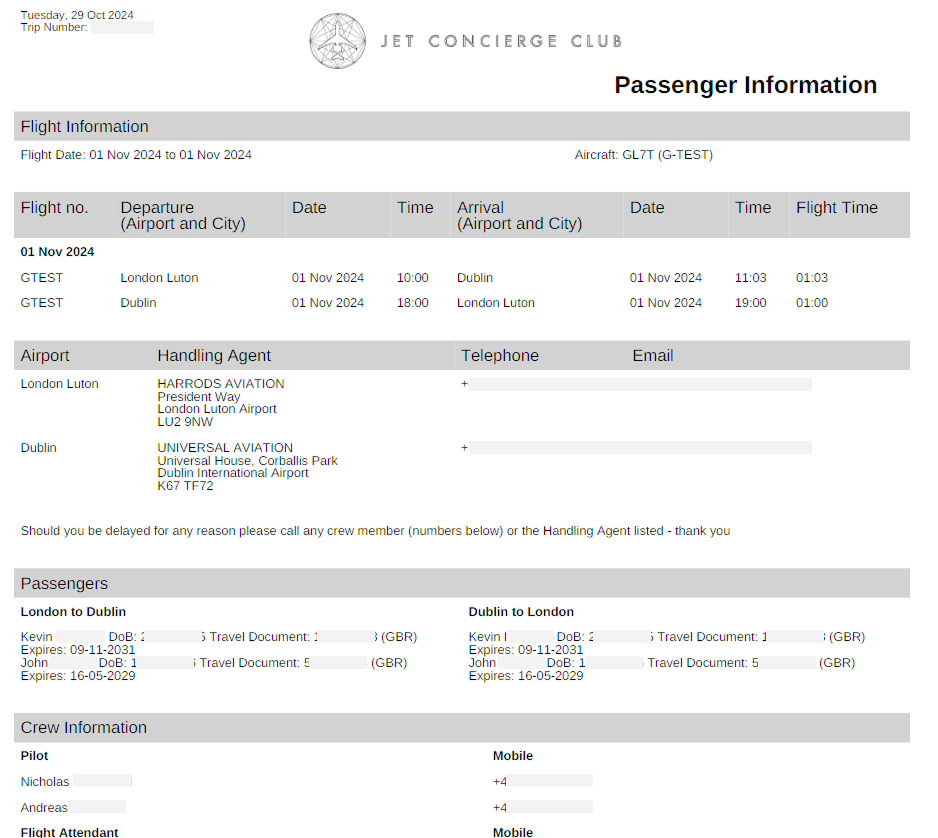
JCC provides the aircraft owners with a range of services relating to their management of their aircraft. These include email correspondence with a PDF itinerary of their chartered flights, including flight information, pilot, crew, and passengers’ details, and handling agent contact details at departure and arrival destinations.
The main problem is that email correspondence, including PDF itinerary attachments, is cumbersome to receive, awkward to manage for passengers, and difficult to read on mobile.
Example PDF Itinerary
The Challenge
The main challenge of this project, besides the limited access to the end users and primary stakeholders, was the proposed project timeline.
Design Phase - 3 months
Kick off to Go-live - 6 months
Available time budget - 20 days
The Process
Considering the project limitations and challenging timeline, we had to move quickly to begin workshops with JCC. Our approach would be to schedule recurring workshops with the client to define requirements, specifications, and user flows, in parallel with wireframing mobile screens and building the specification document.
Design and Specification
There were rounds of competitive analysis to benchmark features and ideas against other flight and travel apps in the industry.
Wireframes would lead to UI visuals of each main screen using the client brand guidelines.
Expectations were that feedback from the main stakeholders (the 30 or so jet owners) would be sparse, with JCC acting as intermediary. For the most part, the JCC project team was the primary contact and participant in the design process. They defined the project priorities and user goals, then collaborated through our design thinking workshops.
Prototype screen flows were iteratively updated to the latest spec documentation, requirements gathering, and workshops.
My primary objective in the design phase was to deliver the final approved UI designs along with the specifications documentation detailing app behavior and interactions, data points, user flows, and logic, as well as descriptions of screens and elements.

Snippet from the draft specification document - detailed the definitions of terminology.
User Research and Workshops
The specification document was a full detail and definition of logic, expected interactions, and terminology descriptions, including elements, icons, datapoints, values, user roles, permissions, primary user journeys, user experience, and UI considerations. It evolved over the course of the workshops and design phase and was routinely scrutinized against the latest understandings, goals, and scope.
Information architecture and the layout hierarchy of available data points were quickly defined, particularly for the flight details screen (the PDF itinerary replacement).
Brainstorming and competitive analysis resulted in a home screen that would allow the user to see a list of upcoming flights as the priority.
Through requirements and wireframe workshops, we focused on a calendar as the first element in the layout of the homepage hierarchy. This expanded during wireframe demo user flows to allow aircraft owners to switch between week and month views, including interactive dates to reveal flight(s) on that particular day.
Benchmarking the Competitive Landscape
Collection of airline and flight apps for testing, research, and competitive benchmarking
Particular attention was given to how other aircraft or flight mobile applications presented important information with a limitation on available space (mobile devices).
Various filtering and date selection UX and UI was noted where there is a careful balance of usability and amount of information displayed on each screen.
Many features and screens such as aircraft selection, flight bookings, and account creation processes were out of scope, however, the user flows, UX, and UI layouts were still important as references during the wireframing phase.
Key Findings and Decisions
Notable insights and reflections from the research phase workshops, requirements gathering, and evolution of the design process.
Holistic view of flights
Data and flight details were received via a central database API for privately chartered flights. We would be designing a solution that received this data and presented it simply and clearly for the users.
Users needed a way to see the flight details (the PDF itinerary information), but also important was a way to view a list of upcoming flights and, to a lesser extent, previous flights.
The most popular idea to explore was a calendar-type view where users could interact with specific dates.
Understanding the personas was crucial to defining appropriate user permissions (aircraft owners, admins, PAs, and passengers).
Small Pool of Private Users
No public account creation. Accessing the app would be invite-only (a separate admin portal to create and manage users).
The app would only be available to around 20 or so users (the private jet owners). Every piece of logic, UX, and design choice was defined against the goals of these primary users.
Prototype as a Communication Tool
The Figma wireframe and visual screens were designed on a mobile-sized canvas for optimal stakeholder review. It sounds obvious, but there was a distinct risk that providing visual designs as simple JPEGs, or outside of a standard mobile case frame or prototype, would increase the chance of misinterpretation of true sizing or accurate look and feel.
The Figma prototype also allowed for interactive user flows and transition animations, giving stakeholders a far more accurate sense of the final experience than static JPEG designs could.
Managing Scope Creep
When the project started to gain momentum through the design phase, there was much feedback from excited stakeholders that, at times, risked the timeline delivery of the design deliverables.
A major part of the specification documentation was keeping the initial scope maintained. Everything else was negotiated as a phase 2 idea, which, because of the status of the client for our agency and the goal of achieving a best-in-class experience, was a difficult task at times.
One aspect of the app requirements that was fleshed out in the specifications and early visuals but eventually excluded from scope was third-party chartered flights, where chartered flights of non-owner users, such as members of the public, would be displayed and filterable from the owners view of their upcoming flights.
The definitions of user permissions and the logic required to display and filter third-party flights from the owner's view was ultimately considered beyond what the product needed to achieve at this stage.
Aircraft owners only needed to see flights that their account was the primary passenger. See UI Iterations below for the previously explored visuals.
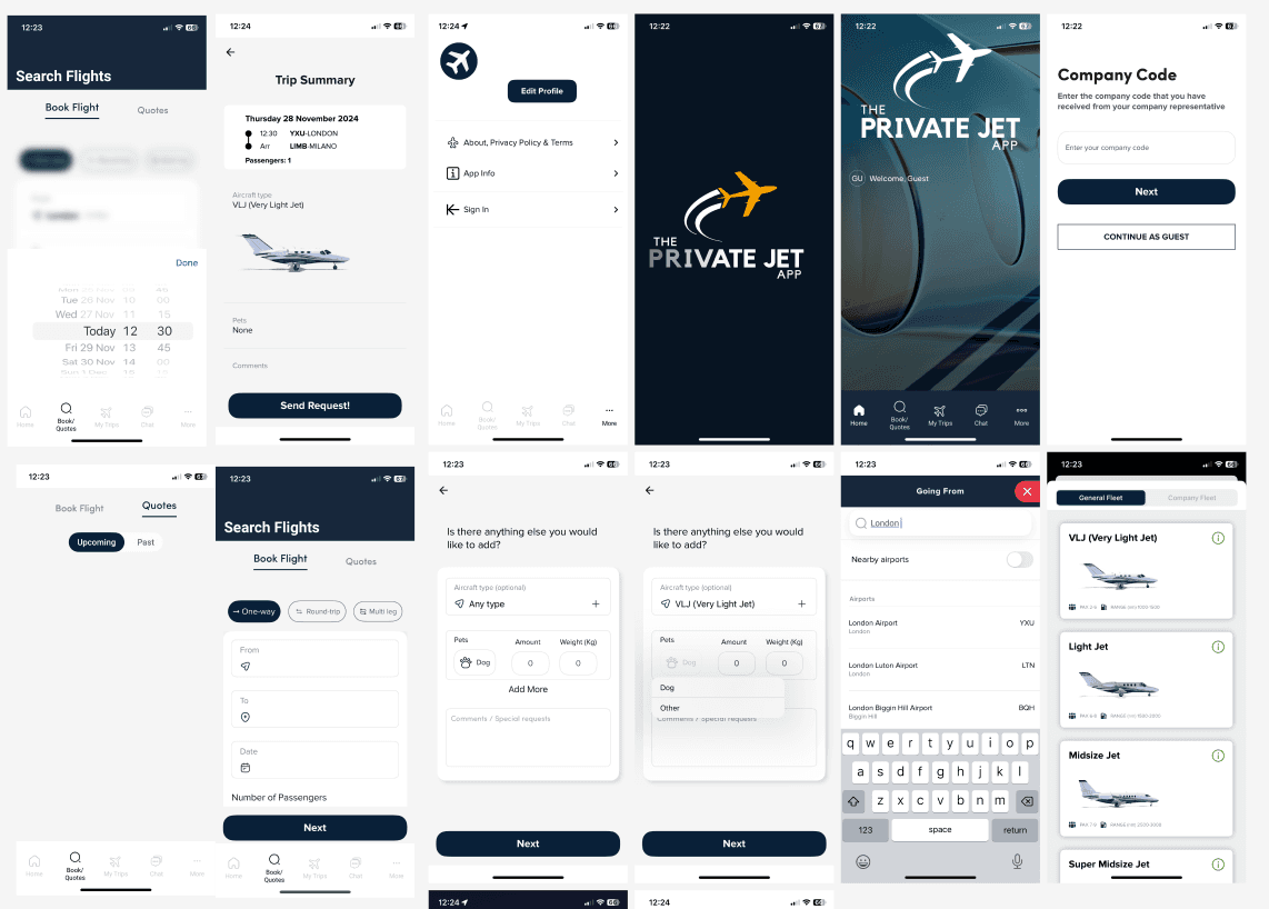
Wireframes and Prototypes
Through the client workshops I created the wireframe screens based on the straightforward user journey: Login > See a list of upcoming flights or select a calendar date to filter > Open a flight to reveal the details and information within.
Further additions based on stakeholder feedback during wireframe walkthroughs were things like switching between flights (left/right) while on the flight details screen, filtering options of the upcoming flights list, and some user-controlled variable styles and formatting.
A key piece of feedback from the early prototypes was how the users behaved with the two main components of the home screen - the calendar and the list of upcoming flights. While the calendar worked well as an easy and accessible means to quickly filter the list of upcoming flights (the results), users valued the upcoming flights list over a full calendar month in view, e.g. most jet owners did not have the need to see the full month of flights as a priority, instead we changed the calendar to display a week instead (the next seven days).
Wireframes were initially kept simple and straightforward before quickly beginning UI design. These are samples that showed login, homepage, and flight details screens.
It became apparent that to maintain our delivery timeline, we would need to transition into the visual design phase while screen specifications and logic requirements were still being defined. Eventually, the UI prototype design also became the main user testing asset for layout, information architecture, and user flows as well as the visual and UI design.
Visual Design
The calendar element was a primary focus of stakeholder workshops and went through various design iterations. The calendar list and flight details screens could be dynamic depending on the types of users accessing the screen (aircraft owners, personal assistants, and admins).
A common piece of user feedback for the UI during early prototype testing, particularly in relation to the calendar element, was "too much visual clutter". So what did they mean by visual clutter? There was data or information that was not deemed important enough to warrant its place on the screen.
We would have to prioritise what kind of information the calendar would display through colours, shapes, and visual behaviours and identifiers.
One decision of this particular design exercise was to streamline the amount of information that could be filtered or highlighted on the calendar dates. For example, the concept that an aircraft owner could view multiple flight types (multiple colours denoting position or passenger flights) on a specific date was replaced with the idea of a single colour to denote if a date had a flight of any type.
The main conclusion of that particular piece of user feedback – users preferred clicking on a date to view flight types and extra details rather than needing to see that level of detail on the calendar level.

Calendar visual iterations showing examples of font sizes, padding, spacing, and visual information layout.
A Late Visual Addition
Through brief prototyping sessions of the (almost) finalised designs there was a key piece of feedback:
Is the first flight in the list the next flight coming up?
The answer was yes, but if it is not easily understood by the users then you have to take that consideration back to the UX or visual design and solve for that hesitation.
To solve for this I added a final piece to the visual homepage of the calendar and upcoming trips - a banner at the top of the hierarchy that specifically displayed the next trip information and linked to the flight details page.

The new banner containing "Your next flight to [Short Name] is in [Days until Flight]"
The Red Gradient Iterations
Another final-final-request was to remove the red gradient that had been added previously as a way to give a warmer identity.

The Final Design
Figma Prototype Link
Note:
The Demo Design button will open a Figma prototype in a new tab. Follow the demo user flow step-by-step below to explore. Alternatively, you can view each screen independently by using the left/right arrows on screen or on your keyboard.
User Flow
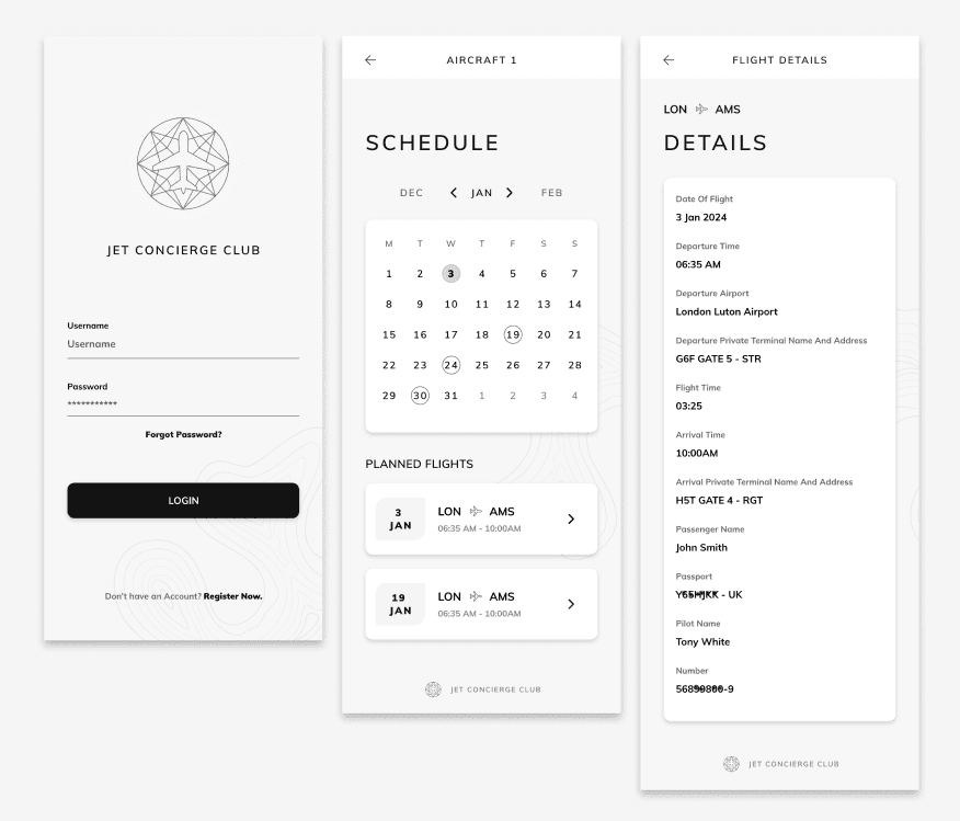
Login
Login screen as the starting point
Click the password field to reveal the login button and 'login' (Note: this is just the prototype to demo the elements animation. On the app the user enters the account details before the login button animates on screen).
My Schedule
My Schedule (Home) screen opens, which displays flights of the next seven days from the current week.
'Today' is the first date by default in week view.
View Month button will expand the calendar to full month view.
Calendar and list are colour-coded personal flights (My Flights) and positioning flights (a non-passenger flight repositioning the aircraft to another location).
Filters
Click on December 10th to filter to that date (click on the date again to revert back).
(Optional) Click on the Filter icon on the top right to open and close the example Filter By screen.
Flight Details
Clicking on a flight will open the flight details (Thu 5 Dec or Sat 7 Dec).
When viewing the flight details screen, click on the calendar icon on the top right to go back to My Schedule or click previous/next to toggle between two flights.
Return to Start
Click on the screen header or logo at any time to return to the login and restart the flow.
Testing
There would be no agile process or second chance. We had one linear shot at delivering the signed off design solution and then developing and deploying it to the iOS App Store after testing.
I was the primary tester ahead of deployment to the JCC project team's test environment, and remained the point of contact for any issues raised during their review.
Testing covered the primary user flows end-to-end including login, schedule navigation, calendar filtering, and flight detail access, with particular attention to data rendering accuracy against the API and interaction behaviour across iPhone screen sizes.
Testing scope also covered overall UX and UI design, user interactions (animations or effects), error validations, user flows, various iOS versions and device models, and accessibility AA WCAG.
Each screen and interaction was tested against the specification document to confirm that behaviour matched what had been agreed in workshops. Any discrepancy at this stage had to be resolved before the build could progress to client review.
Testing findings were tracked in a shared spreadsheet that doubled as the daily communication layer between design and development, logging issues, spec references, and resolution status in a single place to keep the team aligned under a tight deadline.
Figma Workspace of Final Screens


The workspace shows an example of the prototype connections between various components and elements while the screenshots of the screens are of the final signed off designs.
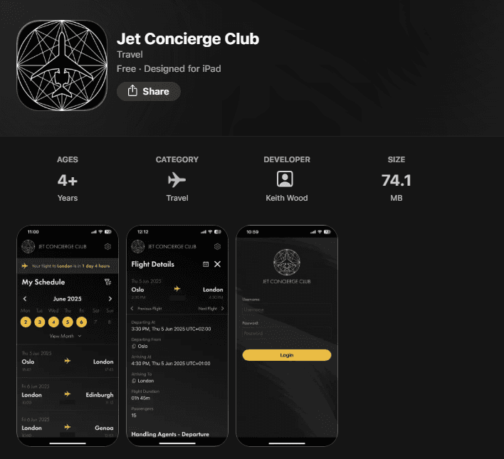
iOS App Store
The JCC app is live on the iOS App Store as a private, invite-only release exclusively for its aircraft owner members. The App Store listing is publicly viewable for reference.
Project Results
Not every project is going to have KPIs or hard analytic data showcasing a positive result for a design solution, and this project, a brand new app with a small and limited number of private users, is one of those instances.
That said, the feedback after project completion from the aircraft owners was overwhelmingly positive, so much so that there are already discussions of a phase 2 to expand the app features and design a new JCC website.
"Love the dark mode styling, the smooth interaction animations, and the simplicity of the presented screen details and information." - Aircraft owner, post-launch feedback.
Key Learnings
Flexibility within tight timelines is crucial – the decision to transition smoothly and quickly from wireframe concepts into visual designs early into the process, based on positive research findings during the workshops with the client, kept us on track to deliver designs to the development team on time.
Simplicity is key – we as designers need to avoid being influenced to impress with dazzling visuals or interactions at the expense of core requirements and UX. The primary goal is to understand the user and their problems and then come up with a design that solves them. Good UX is good UX, especially when the strengths of the design are its simplicity and ease of use. Besides, private jet owners are normal people too.
Primary users are not always accessible – often when designing for a very particular set of users, their direct contributions to workshops, user testing, or even requirements gathering may be minimal. Clear communication with the client, the project team or the stakeholder representatives is essential.
Participating in real-world scenarios for research is a bonus, not a guarantee – just because I am designing a solution for private jet owners and ultra-high-net-worth individuals to manage their chartered flights does not mean I get to board a private jet every few days to get a better understanding of the user challenges, no matter how much I offer.
Slideshow Format
If you would prefer to view a streamlined slideshow I have prepared a Figma slides file for your review: