A Visual Design Exercise
A focused look at the UX and UI design of an urgently required dashboard screen showing the health and status of various restaurant kitchen appliances, with accompanying rationale behind each iteration
UI Design and the Hierarchy of Visual Information
Lighthouse
2024
About This Case Study
In web agency we have many long running projects with multiple phases and deliveries. Normally there is a dedicated design phase that captures requirements of each sprint with defined scope and delivery dates.
An example of a complex and large scale project with a focus on the discovery phase (requirements gathering, defining process diagrams and user flows) is the Alcon Case Study.
However, often times we receive a new request or requirement in the middle of the process or sprint that needs to be urgently added to the live system. A new feature or a change to the workflow or a usability testing finding from stakeholders or users that requires a fast turnaround.
"Hey we discovered this scenario and we really need to solve for X asap…" - the client.
This case study is a short and concise example of receiving a client's new screen request and exploring layout and UI design while adhering to good design principals and accessibility. Sometimes we don't have the luxury of a time or research or prototyping or A/B testing. Sometimes the client just requires the screen design according to their wishes ASAP.
My Role
UX & UI Design - gather client requirements, translate into process diagrams and user flows, create wireframes, define specifications, deliver mockup designs, and guide stakeholders through design challenges. Primary tool: Figma.
This case study represents the story of that design guidance.
The System
The existing system is a management software tool for kitchen workplaces, specifically managing the equipment and appliances like refrigeration, fire sprinklers, HVAC systems, ovens etc.
In short, all of the equipment and appliances are connected to the management system which retrieves data for reporting and review. One of the data variables collected is errors and issue logs (IoT).
The Client's Request
The stakeholders, via our client, had requested that the system get a new feature asap - quickly tell the user the health or status of the equipment or appliance, so that a warning or notification can be sent for urgent review (think major problem with the sprinkler system not responding in the restaurant for example).
The Health check - What was in need of attention or fix, what was operating as normal, what had a system critical issue.
There are four levels or statuses:
Critical (fix now)
Warning (may require attention soon)
Informational (good to know)
No Issues (all good and working as expected)
The Problem
This status data was already in the system but only on an item level and notifications. There was no holistic view of the status of every appliance in a particular room, e.g. the restaurant kitchen.
Here is the client mockup sent to us for the idea on how to solve for this:
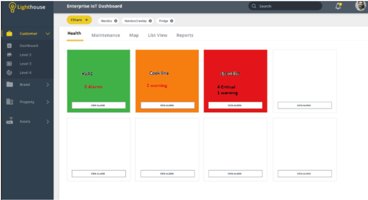
Ok So, What Do We See?
Well not much because it is super blurry! But we can fill in the gaps from the clients notes and a call to further define the logic.
Each piece of equipment or item has its own section/box within a tab called Health.
Every piece of the kitchen equipment should be listed.
There is colour coding of health or status (green is good, red is bad).
There are counters for warnings or errors
There is a button to find more detailed information
What Now?
In this project example, our particular client liked to be actively involved in the design process. Thinking about solutions to problems, various screens or features, layouts and composition of screens. In absence of true user research and testing, when something needs to be delivered asap, this scenario is at least the next best thing.
I decided to take that visual example and run through some iterations and design philosophy with the client - gestalt principals, typography, colour theory, user behavior.
My goal is to guide the client into making the best UX and visual decisions.
Replicate the Example
To get the ball rolling I replicated the clients screen example and used it to start off our discussions about the user goals, the user journey, the critical requirements, and the UX of the screen idea. This case study is about the screen design specifically.
The key was, with a limited amount of time, to start with the visual idea presented by the client and then work towards improvements in UX and UI.
We had a design system already defined from an earlier phase of the project. What you see here is not an example of polished or final UI design. Think of these visuals as a quasi-wireframe/visual mockups.
Lets add some icons to associate the various levels of severity and clean up the data that can be displayed at any one time per item.

Some things are immediately apparent, like the failing colour contrast ratios. When it comes to the final design we must abide by the accessibility and the WCAG 2.1 standards.
Also everything is a bit difficult to read against the full fill of the boxes. Yes colour coding is a good idea for severity recognition, but readability is also important.
Reduce and Focus on the Use of Colour
Icons and buttons can hold the colour that designates severity. Everything is now much easier to see and understand at a glance.

But does everything need a colour? Are all statuses equal?
No.
When we have visual information competing for the users attention, it is better to only priorities the information that is most valuable at that moment and hiding or reducing anything that is not.
The appliance that is running smoothly does not need to shout out to the user (visually) that EVERYTHING IS FINE… Instead, how about only displaying the statuses that require immediate attention or (Critical and Warning).
Critical and Warning Emphasis
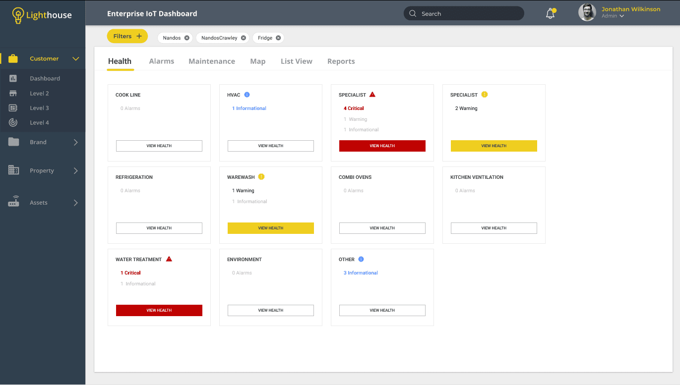
By reducing the visual impact of secondary priorities (the less important statuses) we have strengthened the ability for the user to quickly identify the most critical issues as the priority.
On a side note there had been iterations exploring the use of a full red box for the most critical status. However, ultimately it was decided to go for a more straightforward consistency of white boxes for font legibility.
Further Updates
As we discussed iterations during the workshop there were several further ideas to help with UX and UI design. Some vendors using this system have kitchens or warehouses or factories that have dozens of appliances. While having multiple critical issues active all at once was rare, this health check design needed to take that information into consideration.
Order by Status Severity
Status hierarchy, and the primary user goal of seeing the most important health checks quickly, can be reflected in layout too, not only by colour. Order the status by severity (critical first and so on).
List Verses Grid
The client preferred a grid layout than a single column list so while the grid layout prevailed, we can still order the appliances from top left to bottom right (FYI this application was responsive so ordering was particularly useful in those scenarios). Most of the system screens and dashboards were setup in a grid layout - that familiarity helped with the UX of this screen design.
Search and Filter
How about letting the user be in control of what kind of statuses they see at any one time? A filter was added that would allow the user to easily check which statuses they wanted to view (default is all at once). Page refresh will always revert to the default (we don't want critical issues being hidden by any "remember my choice" logic).
Resize the grid
Considering the amount of possible appliances and equipment some business have for any one location or room we need to ensure that the grid is streamlined to allow a maximum amount of items visible at any one time.
Multiple Issues per Item
Some items can have multiple number of issue sat any one time. In accordance with keeping the boxes streamlined these counters were placed on a single line within the box (desktop version).
Timestamps
When was the last time this item had an issue (AKA an "alarm")? When was the most recent severe issue? Adding this allowed users to recognize, from the dashboard level, how long the item was in the status.
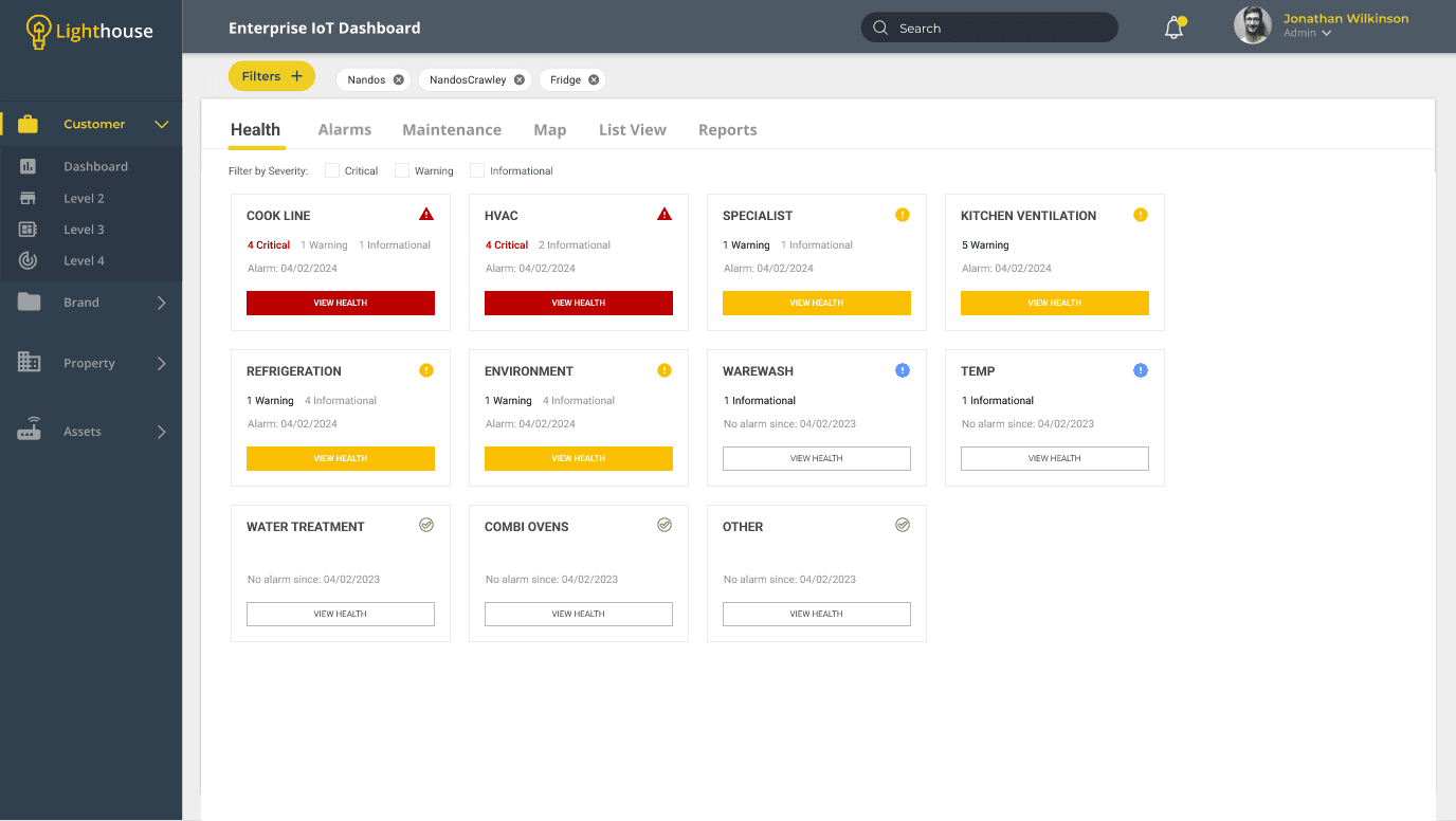
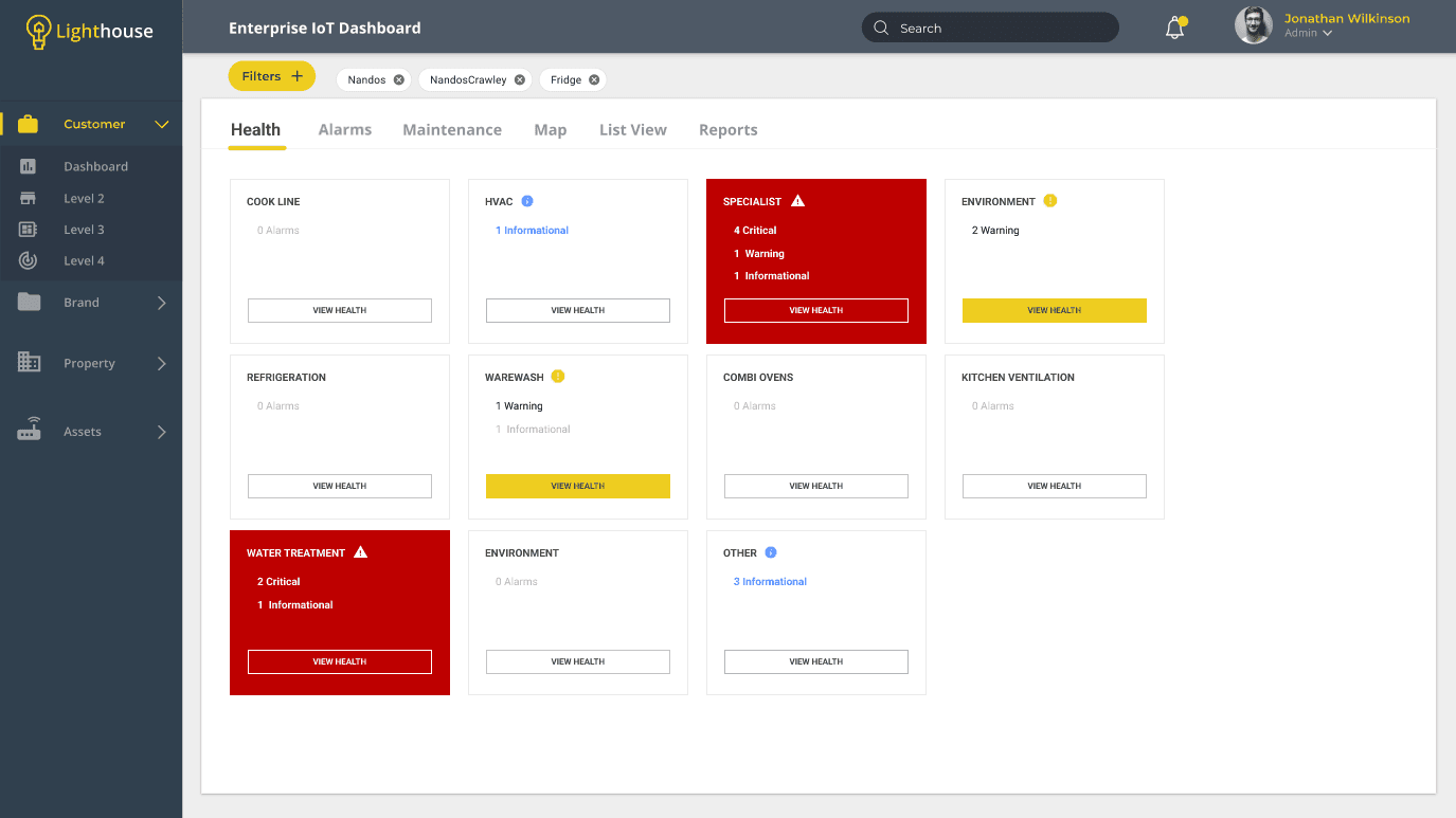
One of the Final Versions
This example is close to what was eventually designed and signed off. The time spent on this particular design exercise, including back and forth rationale with the client, iterating, and guiding the client to a sign off, was the best part of a day. The feature was built and tested within the week and then deployed to the system.
Key Take Aways
Good design principals can be followed regardless of time constraints. The most important things to undertake are:
Understand the problem (what is missing from the current system and why is it a problem)
Understand the user goals (how does this impact them and what do they need to do or see to solve for this)
Iterate an idea on paper, and proceed to wireframes (information, layout, data, variables)
Narrow down the best UX and UI within budget and/or timelines and provide rationale for client review and sign off
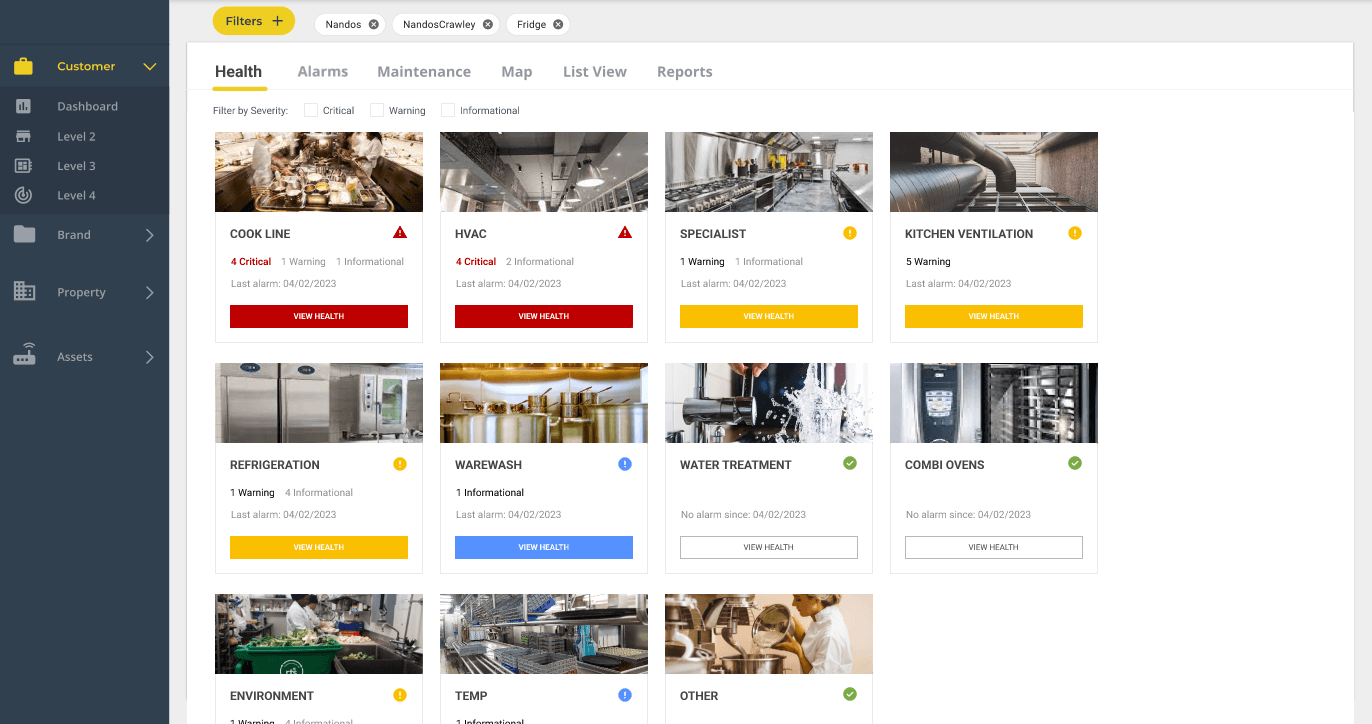
Bonus Version - Use of Imagery
Imagery can be tricky to implement depending on the user goals. Ultimately you have to ask if it adds value to the UX. In this scenario the items in the restaurant could be photographed and a thumbnail added to each within the system. It could help with recognition, allowing users to quickly scan to find particular appliance.
However, it could be a point of conflict if imagery is too abstract or not directly associated clearly with the appliance (some appliances are not in one location or difficult to photograph). If all items cannot have adequate imagery thumbnails, or some resort to placeholders or generic imagery, then the better outcome for UX is to keep them as optional inputs to the system and hidden by default. Allow the appliance titles to do the talking.